Wine Label Text: How Much is Too Much—and Too Little
What information consumers want to see versus what professionals need
OVER THE YEARS, Wine Business Monthly has run a number of articles about labels: from the paper stock and ink, to the colors and designs that adorn them. We thought we’d run them all until we started rifling through the comments section in the judges’ scorecards at the 2020 PACK Design Awards. While there were a number of hilarious comments—“Seriously, I HATE wax” or “Is this pumpkin wine?”—there were several variations on a similar theme, and it was one we hadn’t seen before.
“What’s in the bottle?”
“Where did this come from?”
“Not enough info.”
Every judge made this comment (or some variation thereof) on at least two packages, and they all zeroed in on a few that were particularly vague. So, what does this mean?
In essence, the team of judges, made up of sommeliers, wine buyers and writers, were disappointed in those labels that didn’t provide enough information on either the front or back label to give them a good sense of what was in the bottle.
Each package was scored on four criteria:
• Visual appeal: Does the new example catch your eye visually? Does it stand-out from competitors?
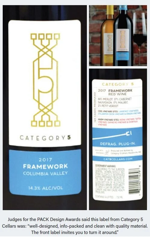
• Design functionality: Does this example properly store wine? Is the artwork legible? Does the label tell you everything you need and want to know clearly and easily?
• Appropriateness for the price segment: Is the design appropriate for the price point? Is this example a leader in design for its price point?
• Creative utilization of the format: Applicable for all categories, including Classic, Luxury, Can, Alternative Packages and Series. The Redesign category instead looked at how successful the redesign was. The Assorted Set instead looked at cohesiveness.
It was that second piece of criteria, design functionality, that we dug into. We asked one current judge, a former judge and a sommelier their thoughts on label information, specifically what they need to know, what they want to know and what works.
Front of House
Inevitably, no article on labels would be complete without at least one mention that the front label is stuck between a rock and a hard place. In just a few square inches, it needs to convey a brand story, the type of wine and where the grapes came from, all while being eye-catching amongst a sea of similar labels.
As Dr. Liz Th ach, MW, distinguished professor of wine and management for the Wine Business Institute at Sonoma State University, succinctly put it, she wants to see, “an eye-catching design, name of grape varietal, appellation and vintage.”
Evan Goldstein, MS, co-founder of Master the World and Full Circle Wine Solutions, and a judge at the PACK Design Awards this year, said that he doesn’t need a ton of information on the front label.
“Just the facts ma’am—winery/wine name, geography, grapes/provenance, a POV as defined by graphic positioning.”
In other words, the basic information is what Thach and Goldstein want on the front label. Without that information, it’s up to the consumer’s imagination and preconceived notions to determine the relative quality and expected price point based on design alone.
The Wine Intelligence “Wine Label Design in the US Market” report released in April 2021 dove into this, determining which label designs consumers associated with quality and intend to purchase.
For both red and white wines, the report ranked performance based on net intent to purchase but also looked at net label appeal, net quality expectation and price expectation.
Perhaps unsurprisingly, the top three label designs for red wines were those considered “Prestige.” These labels feature heavy use of metallic colors on a black background, crests/logos, Serif fonts and uppercase lettering and, most importantly, a clear winery/brand name with a focus on varietal, vintage and region.
Prestige is followed by “Stately Classic,” which features a limited palette of black and white with a single accent color, embossing, very few images with the occasional landscape or vineyard. Text on these labels is used to add the perception of quality and focus more on the wine name and varietal than region and vintage.
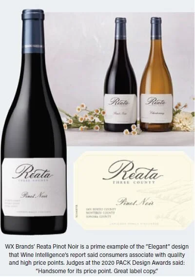
After that, “Elegant” labels with significant white space, hand-rendering and simple storytelling reinforce text that centers on the winery brand. Support text centers on varietal, region and vintage.
Those results echo PACK judges’ comments and wishes for a front label. Consumers want to know what’s in the bottle and where it’s coming from and knowing these increases expectations for quality and price.
On the other hand, the label designs that did the least to convince consumers to purchase red wines were the “Bold Text,” “Simple Contemporary” and “Surrealist” themes.
For whites, “Stately Classic” and Elegant” are tied for most effective, followed by “Prestige.” The designs that are least effective are also “Bold Text,” “Surrealist” and “Simple Contemporary.”
While these labels deliver on the text our experts want to see, funnily enough it’s the designs themselves some of the judges don’t particularly love.
“I am very tired of the boring minimalist type labels with a cream colored background and just the name of the winery,” said Thach. She wants to see more color and design from brands.
The future of wine labels though, is all about providing even more information without losing aesthetic appeal.
“I don’t really care about what I see at the front. Many things make a bottle pop, from a historical castle on a Chianti to the F.U.C.K. bottle,” said Nadine Brown, sommelier and former wine director for Charlie Palmer Steakhouse. She knows that, in general, consumers are looking for more: information, story or even value of a brand. Sustainability and fair trade practices are essential to some. Brown said that conveying this information is nothing short of a “tall order.”
When There’s Too Much Information
When it comes to the back label, it’s often a lot easier to state what not to do.
Quite often, Brown finds that providing too much of the wrong information can be boring, or even condescending, to a consumer. As Brown stated, aroma and flavor characteristics aren’t important and quite often incorrect.
“Don’t put descriptive notes, like ‘hints of wild strawberries’ or whatever,” she said. “That might not translate to the reader or be out of date/taste by the time they get the wine in their glass.” In addition, where one drinker picks out strawberries, another might find cherry.
“I know labels are small and don’t offer a lot of space,” she added. “In general, I believe in speaking up to consumers. They have been spoon-fed for so long and are kind of over it.”
Thach disagrees, and wants to see both a brand story as well as what the wine tastes like. “I would like to see alcohol, calories, and carbs, too. I hate hunting for the alcohol level, and don’t know why some wineries try to hide it when it is required by law,” she said.
Generic food pairings are a big no for Goldstein as well.
Another don’t? Avoid overdoing it on the winemaking techniques.
For the most part, wine is made in the same way with the same methods and some slight variation based on the region, climate, vintage and house style. Some back labels, Goldstein and Thach posited, go too far into the weeds about every vinification method used—whether it matters to the final product or not.
Aspects like length of barrel aging and new oak percentages are fairly common on wine labels but may not be necessary if they don’t have a major impact on the final flavor profile and texture.
So, what should you do? Goldstein says to add deeper insights into your brand story or point of view. What makes your wine different from all the others? He also added that a call to action is essential these days, whether it be through a QR code, a URL or even an invitation to come visit.
“It’s asking too much to expect a label to be the end all, to do more than basic information: winery, wine, etc., but seduce the consumer in with something that catches attention/the eye,” he said. Make sure the essential items people want to know are on the label: which grapes are in the bottle, and how much of each, one to two key points or messages, and legal requirements.
The Future of Labels
Label trends come and go—or in the case of “critter” and other “gimmick” labels, not soon enough, according to Goldstein. But these days, he also sees a lot of U.S. winery labels taking cues from their traditional European cousins but imbuing a more modern touch. He’s also seen more than his fair share of cartouches on the bottles themselves—a signifier of high-end or premium wine.
QR codes and other elements that lead consumers to fi nd more information through the use of their phones are expected to grow in popularity as well.
“The 19 Crimes series has taken it to another level,” said Brown. “I know we will see more of that and the use of scanning and tech to get more info than can fit on a label.”
What the Generations Expect
Th e Wine Intelligence survey also looked to see which designs were most effective with consumers as sorted by age cohort. What did Gen X (aged 40-54), Millennials (aged 25-39) and Gen Z (aged 21-24) regular wine drinkers find to be the most enticing?
For red wines, Gen Z found “Boutique” designs to be the most appealing and were likely to make the purchase if a label featured those characteristics—a far less traditional approach than older generations.
When it came to the quality expectation, however, the cohort still expects “Prestige” labels to reflect wine of the highest quality. Millennials, on the other hand, found that “Prestige” labels had the most label appeal, conveyed the highest quality expectation and they were more likely to make a purchase of wine featuring this type of design. Millennials are generally more open to less traditional designs; “Modern Graphic” was a top design for the cohort.
Lastly, Gen-Xers look to “Prestige,” “Elegant” and “Stately Classic” to signify quality, with labels that feature people tied for third. This age group is more traditional in its wine-buying approach.
One thing remains clear: that no matter what the image, coloring or font, consumers and industry members still want to see basic and key information on the label.
———
This article originally appeared in the June 2021 issue of Wine Business Monthly


